For this project in semester 2, in groups we had to design a prototype for a new mobile gaming device, along with a game for the
device. In my group we came up with the idea of a virtual reality headset that has a breathing sensor. For the game, we decided on an idea
of a horror game called 'Post Apocalypse'. In the game, the player has to deliver fresh goods to survivors of the apolcalypse in order to get
building supplies in return. However, the world is infested with zombies and therefore, the player has to hold their breath or change
their breathing when sneaking past zombies.
Game Logo Research:
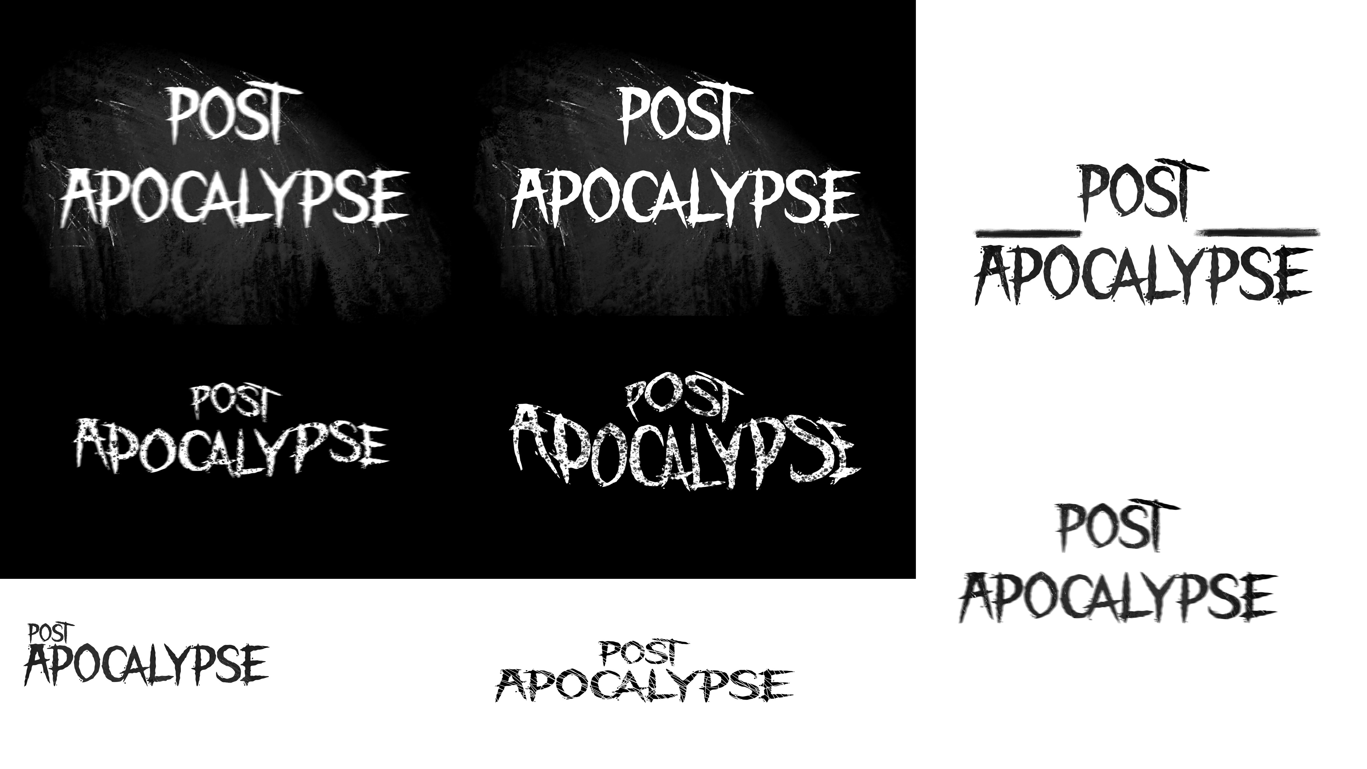
For my first task, I designed logos for the horror game. I started off with carrying out some research into current horror game
logos and ideas on how I could design my own logo for the game. I googled horror game logos and created a moodboard of a variety of
logos I found. When carrying out my research, I noticed a lot of similarities and popular elements within the logo designs, such as,
distressed or rugged font choices as these create a scary aesthetic. Popular colour choices included mainly black, white and red as these
colours can be easily manipulated and used to create a horror design and red is often used as it connotes blood and danger. I also noticed
from my research that it's common to have logos with text instead of a graphic or icon and popular fonts such as serif gothic fonts.
Game Logo Designs:
For some of my designs, I added splotches/splashes to portray the look of blood. For one of my other logos, I created the look of scratches
as this also fits the theme of horror.
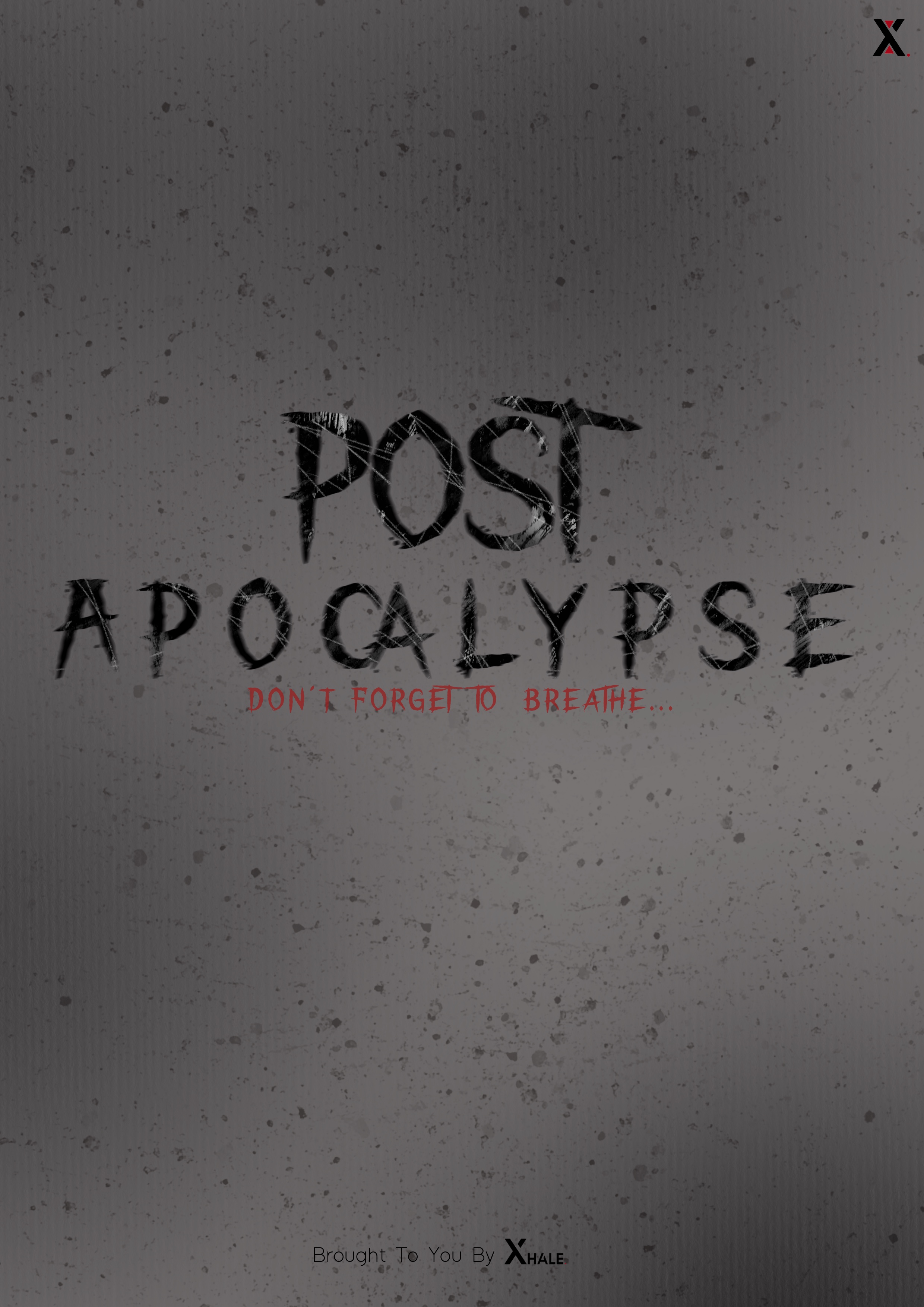
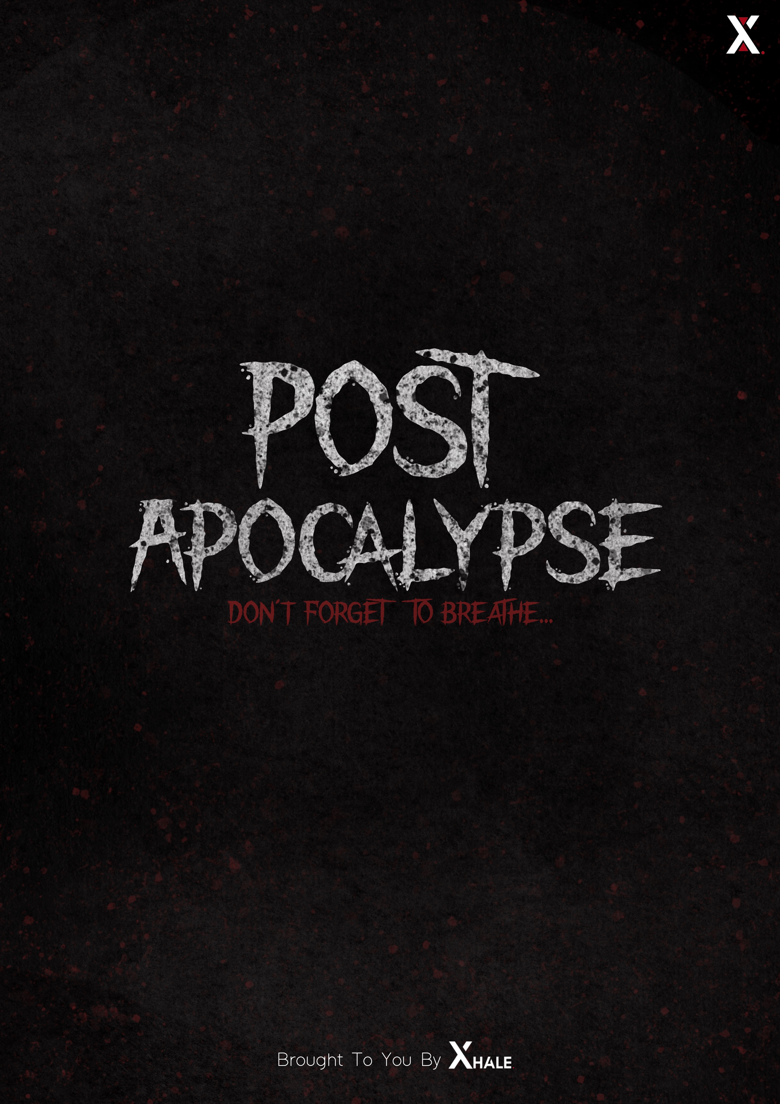
Final Logo Design:
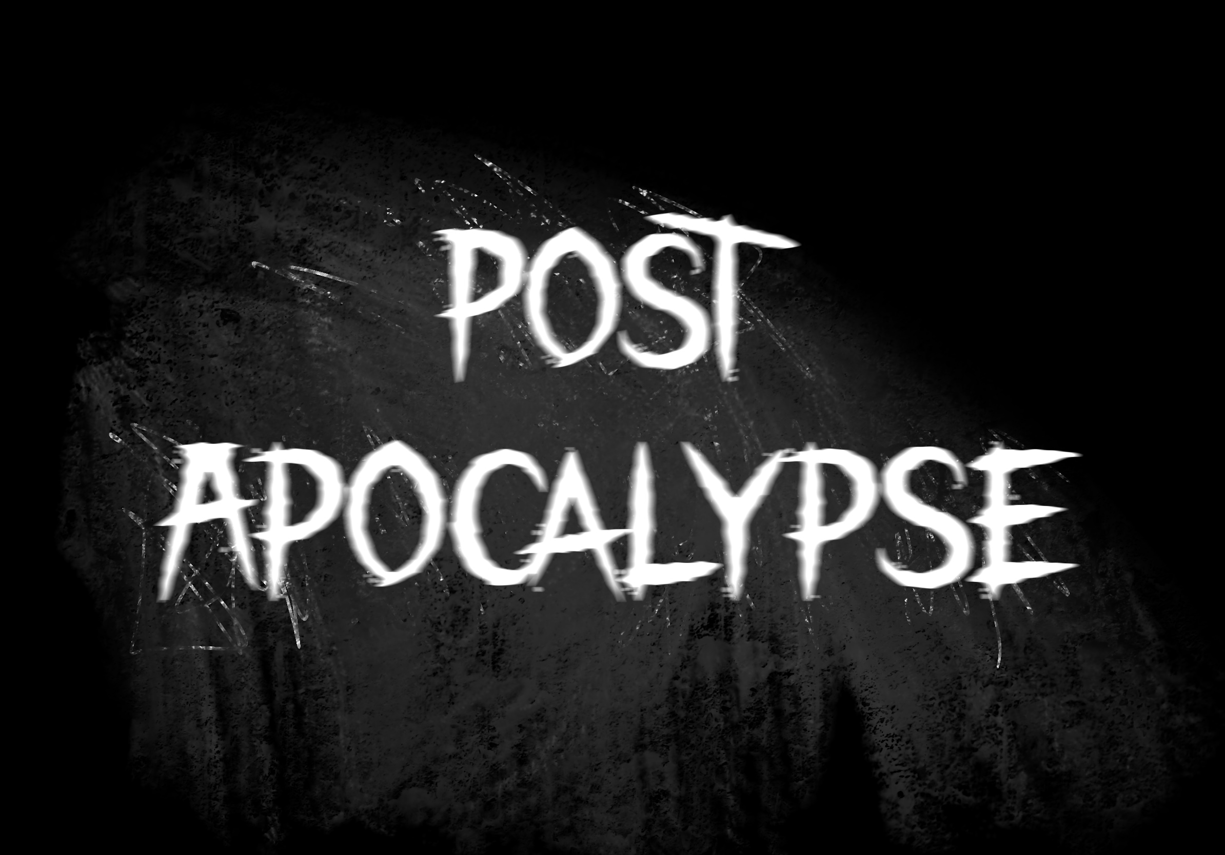
For my final design, I chose to have a black background and white text as it'll be easier to read. I decided
to slightly blur the font as it is a popular aspect of horror game logos and makes the logo appear more mysterious and scarier.
The background is black and slightly scratched to reflect the horror within our game and this also adds texture to the logo and background.
The font I used is called 'the night lamp' which I downloaded online and then created the designs in Procreate. I chose this font because it fits our theme
of horror and is easy to read.
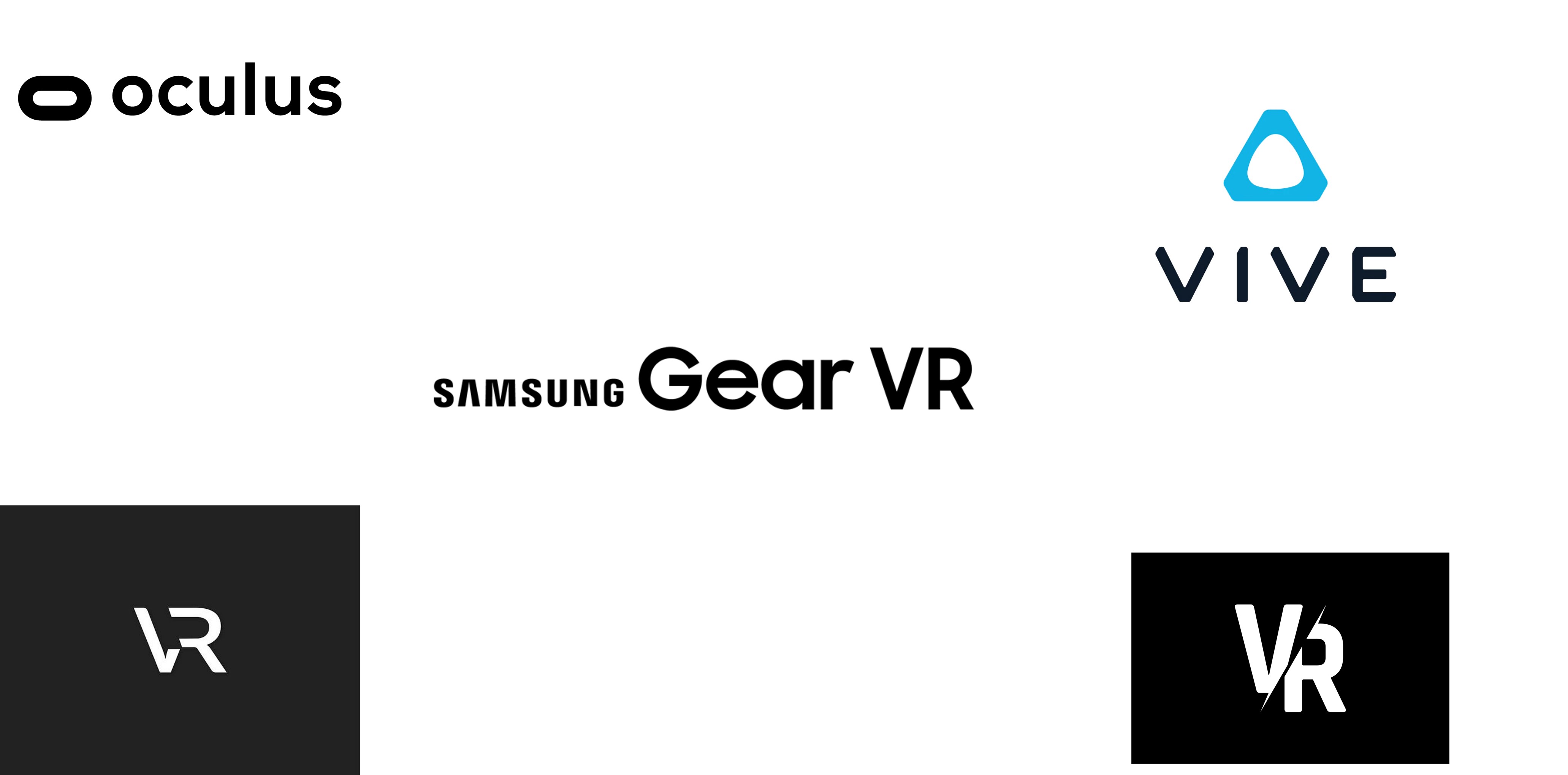
VR Logo Research:
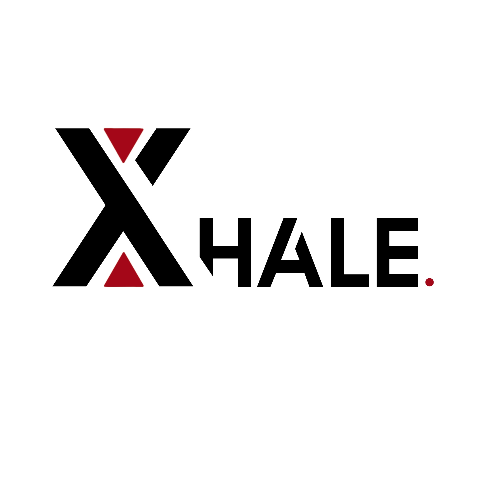
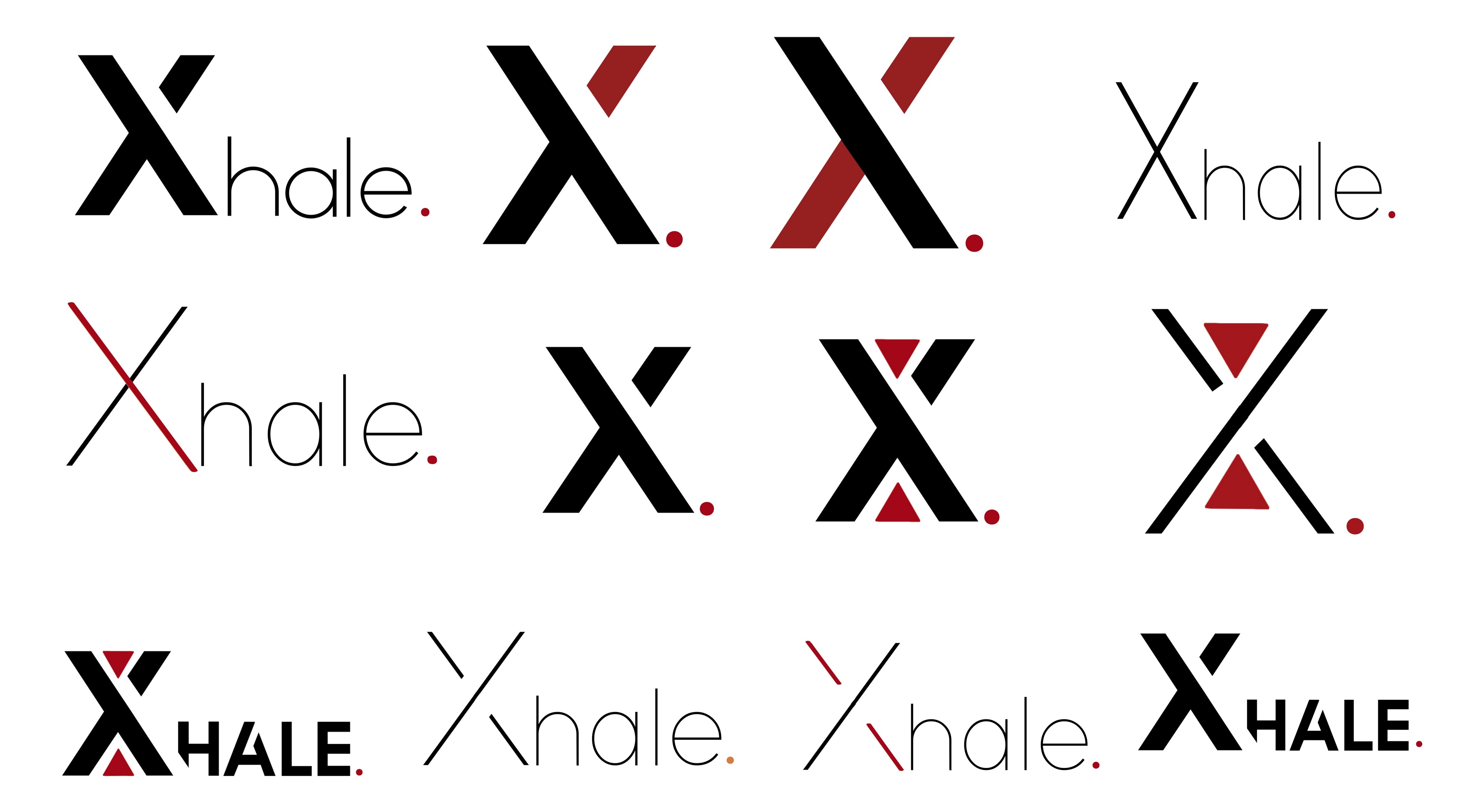
For my second task, I designed logos for our VR headset. As a group, we decided on the name 'Xhale' for the headset as it
relates to our unique selling point which is the breathing aspect of the game and headset. The name is also not too long or hard
to pronounce, it is fairly short and catchy which would be more intriguing for the audience. For my VR logo designs, I started off with
researching already existing VR company logos by searching ‘VR company logos’ and ‘VR game logos’ on Google images. This allowed me to see aspects
were commonly used within VR logos and what I could add to my designs. I made another mood board of the most popular Vr company logos as well as other logo designs for VR companies.
From my research, I found that it is common within VR logos to have a very minimalist design with San serif fonts. For example, the Oculus logo only includes the title of the
headset along with a small graphic that reflects the VR headset. I wanted my logo designs to replicate the minimalism that is popular within VR logos so that mine look professional and modern.
VR Logo Designs:
I used a san serif font as the use of this creates a modern look to the logo and is easy to read. As our brand colours are black and red,
I wanted to implement these colours in a subtle way so that they aren’t too bold and vibrant. For the separate icon logo,
I added two triangles within the logo which creates the look of a timer/sand timer. This reflects part of our game as
time is a significant factor within the game such as the different days within the game, and the time when the player has to hold their breath.
Advertisement Poster Research:
I also had to design advertisement posters for our game. I decided to create three seperate designs so that there could be a
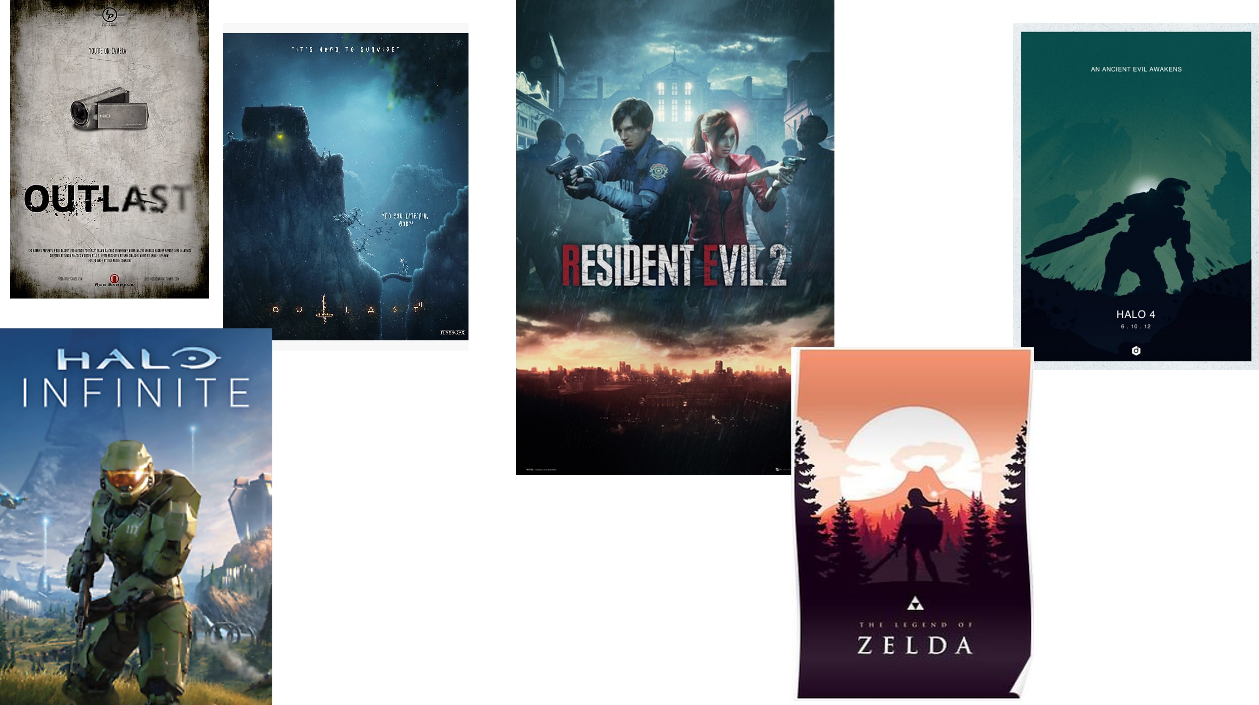
variety of different designs. I started off with researching current advertisement posters for video games. I first looked at horror game
posters so that I could gain insight into what is commonly included within horror posters. From this research, I noticed that the title of the
video game was usually the main focal point, as you can see in 'Outlast' and 'Resident Evil', their titles are in large font sizes and near
the centre of the poster. I also noticed that the posters are fairly minimal and include an image of gameplay or have a minimalistic background.
They include little to no extra text so that the main focus is on the image or title of video game. I also decided to look at
non horror video game posters too. When researching this, I found that they had similar aspects to horror game posters. They
also only included the game title and a background image of gameplay or a still image of the main character.
Poster Designs:
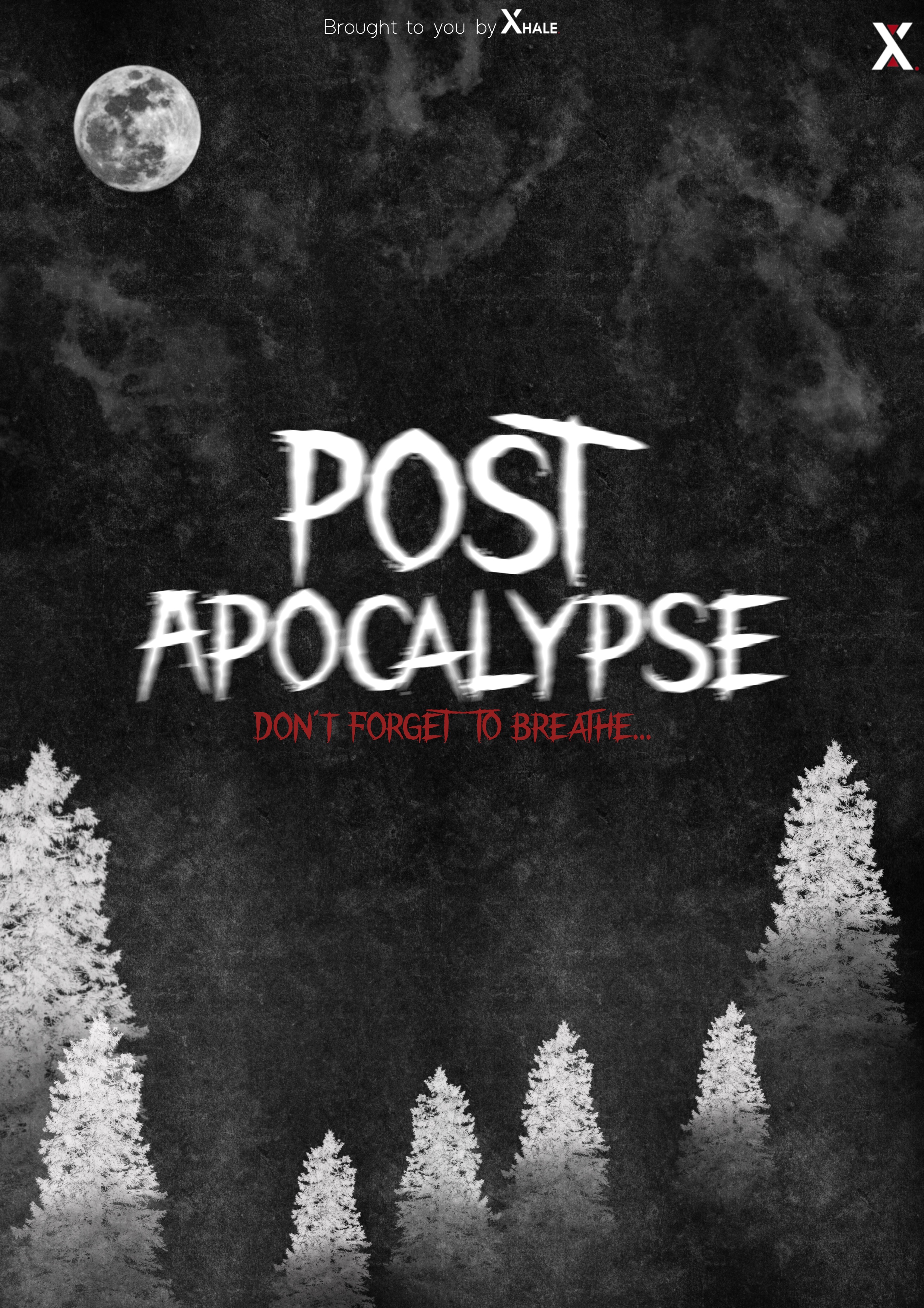
For the first poster, I chose a black background as this reflects our branding colours and is fitting for a horror game poster as it is eery and scary.
I then added a texture over the top of the background as it adds dimension and creates a distressed look. I added the name of the game in the centre of the
poster as this is the main focal point for the audience. I made this text slightly blurred to make it look more mysterious and horror like.
Underneath the title,
I added more text in our other brand colour saying, ‘don’t forget to breathe’.
I thought that this would be good to add as it links to our VR headset and gives a hint into what the game includes. To make the background more horror themed,
I decided to add graphics of trees and a moon to create a scarier ambience within the poster and I used a brush which creates the look of clouds.
I decided to add this to the poster because it adds more detail and creates the look of a landscape.
I included the Xhale icon in the corner so the audience knows what
device the game will be on and which company. I also added text which said, ‘brought to you by Xhale’, which also gives the audience an insight into who the game is being created by.
For the second poster, I wanted to create a different aesthetic compared to the first one. I still decided to have the title of the game in the centre of the poster as it’s the main focal point and will gain the most attention.
For the title, I added different textures and used multiple brushes on ProCreate to create a distressed and scratched design to the font,
which reflects our branding and horror theme.
I also decided to put the same caption underneath the title so that the audience has an insight into what our game includes.
I wanted to keep the background fairly minimal yet effective, so I decided to design a distressed and worn-down look to the background. I added a paper texture to create a realistic look of a poster made with paper.
On top of this texture, I added ‘splotches’ because they create the look of splattered blood and adds to the distressed aesthetic.
I wanted this poster background to be more minimal compared to the first poster so that the focus remained on the title in the centre of the poster. Having this minimal design will also leave the audience with
curiosity over the game as the poster doesn’t give away a lot of information on the game.
For the third design, I wanted the poster to be more minimal compared to the other two designs. To accomplish this, I kept the background black and added a texture over the top with our branding colour,
which creates the look of splattered blood. I changed the opacity of this texture, so it wasn’t too vibrant and overpowering in contrast with the title of the game in the centre.
I kept the title centered as it’s still the main focal point within this design. For the title, I used a brush in procreate over the top of the font to make the text look distressed and worn down.
I thought that this was fitting for a horror poster as it creates a mysterious aesthetic and also reflects our use of zombies in our game.
I put the same caption underneath the title as it gives the audience a small insight into what our VR game includes.
I also included ‘brought to you by xhale’ so that the audience knows which company is creating the game and what console it’ll be available on.
Social Media:
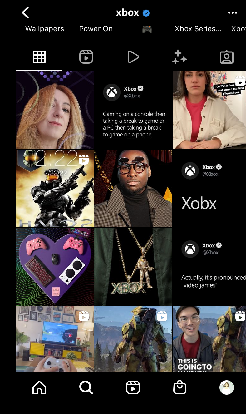
One of my roles was to also design and post social media posts on Instagram. I first looked at other gaming company instagram accounts such as Xbox and PlayStation to see
what their pages were like and what content they posted. With Xbox, I noticed that the majority of their posts consisted around merchandise, their consoles, and gameplay.
Their page did not have a repetitive theme and they posted content that their audience would want to see, such as information about new and current games or posts about
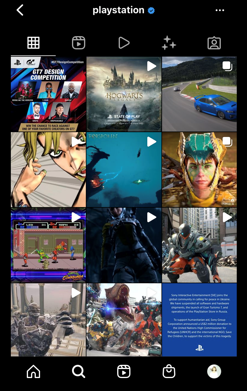
new controllers or other accessories for Xbox. When looking at PlayStation's instagram, I noticed similar content within the two gaming accounts. PlayStation also resolved
their posts around video gameplay, updates and information about their games and new accessories for their consoles. However, PlayStation's page is very video heavy and the
majority of their posts are videos of their games.
When designing our instagram posts, I wanted to keep the minimal but mysterious so that they align with our branding and horror theme. I first posted our 'Post-Apocalypse'
logo to introduce our game to instagram, and gave a brief description as the caption.
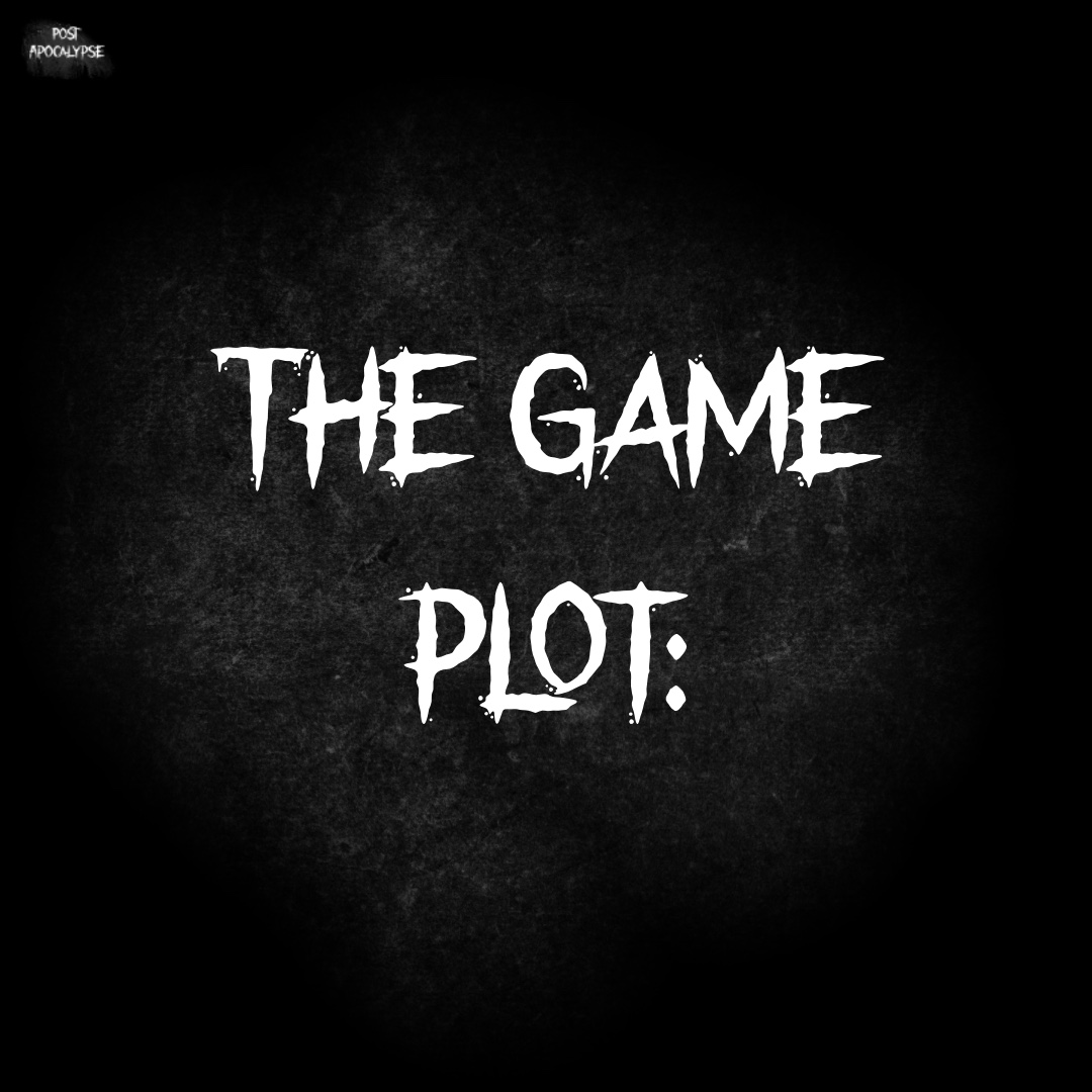
I then designed a post for our game plot so that our audience knew what was involved in our
game and what the player would be doing. For this post, I kept the background black and added a texture over the top, with the same font as our logo. I decided to design our posts
this way so that they look neat on our page and also reflects our horror theme.
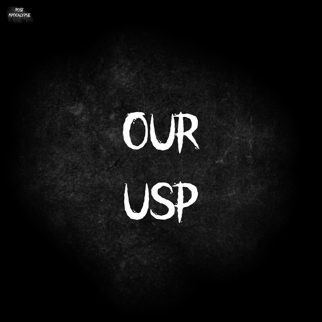
Next, I designed a post to tell our audience about our unique selling point. With this post, I went
with the same theme as for our posts, with the black background, texture and same font as our game logo. I wanted to post about our USP so that the audience can see how our game
differentiates compared to other VR games on the market.
For the final post, I decided to upload our new and improved Xhale logo,
so that our audience can see our updated branding and logo.