IMOGEN BUTTIMORE


Unwind

Interactive Environment Project: Year 1, Semester 2.


Overview of the Project
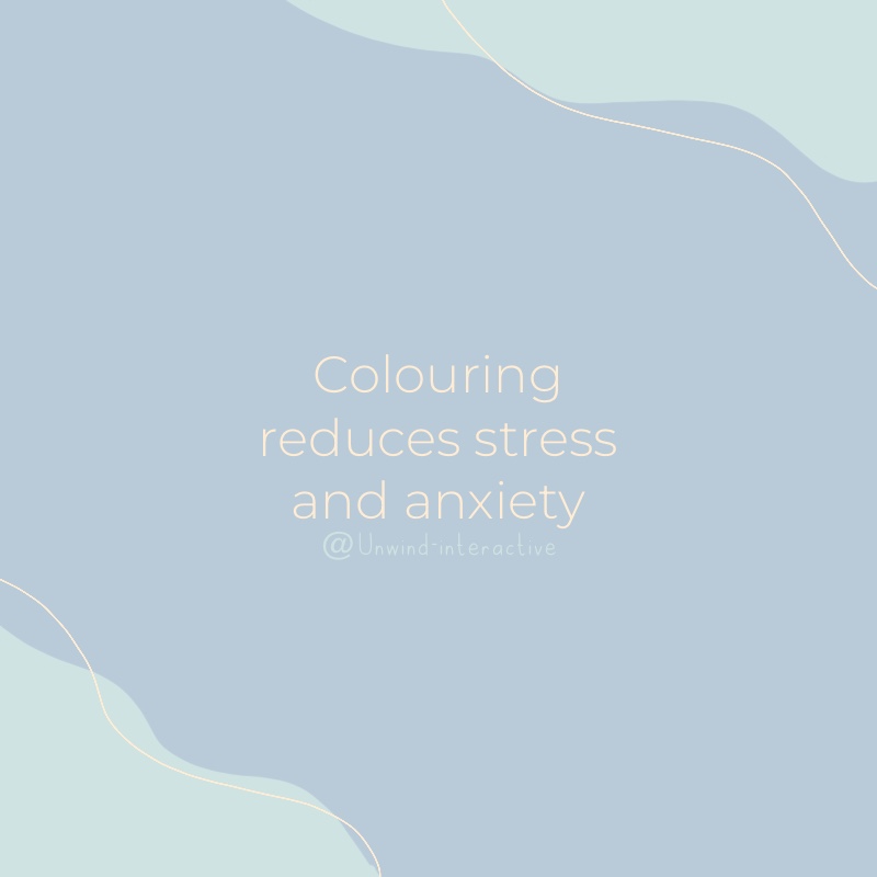
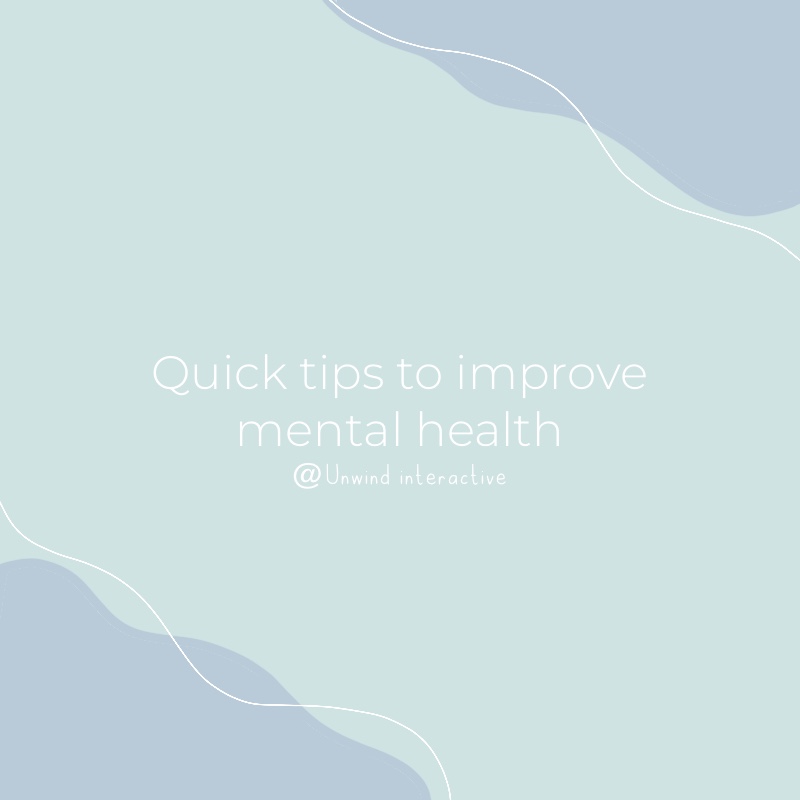
During my second semester, we undertook a group project. We had to design an interactive project for a specific target audience from a list of audiences given to us. My group chose people with disabilities for our audience, and we came up with the idea to create an interactive website for people suffering with mental disabilities. Our website/app aims to offer relaxing games and other useful resources. To make our website more interactive, we decided to include the Google Teachable Machine, which offers facial recognition. This will help us to understand what our users are feeling. We decided on the name 'Unwind' as this reflects what our website aims to acheive, by helping others relax and unwind through our relaxing resources.

Branding Colours:

colourscheme

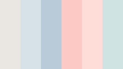
We found this colour palette on schemecolor.com. We chose a scheme of calm and muted colours to reflect our overall brand image as we wanted to reflect the image of wellness and a serene aesthetic when our audience reached our platform. The colours we chose contrast with each other well and connotes calmness and peace. I found this specific colour scheme from searching for calming colour palettes on google, as well as googling calm colour schemes. The colours chosen contrast well together and gave me a wide range of design ideas when it came to my project work.


Logo Design and Research:

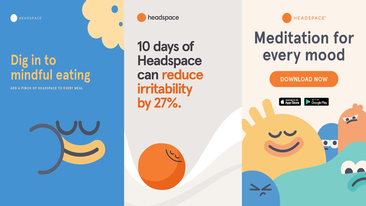
I first started off with designing logos for our project. I decided to research current mental health/wellbeing apps that are already on the market, such as Headspace. This allowed me to see their branding choices and logo designs, as well as what their services feature. When looking at Headspace's logo, I noticed that it was very minimal and simple. A san serif font is used and only a couple of colours which are black and orange.

headspace

I thought that their logo fit their branding image of relaxation as the logo isn't too bold or over the top. I also found more inspiration on websites such as Pinterest and googling phrases such as ‘mind graphics’ or ‘mental health graphics’ to find graphics that I could incorporate into my designs that reflect our brand name, ‘unwind’.


Logo Designs:

unwindlogo1

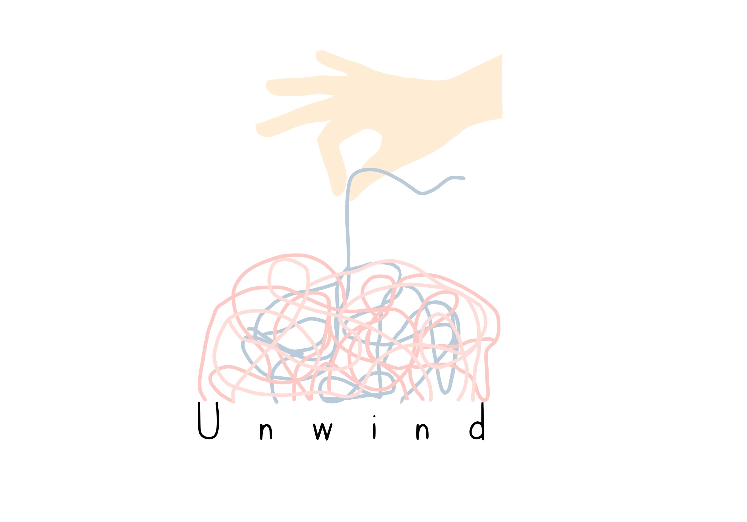
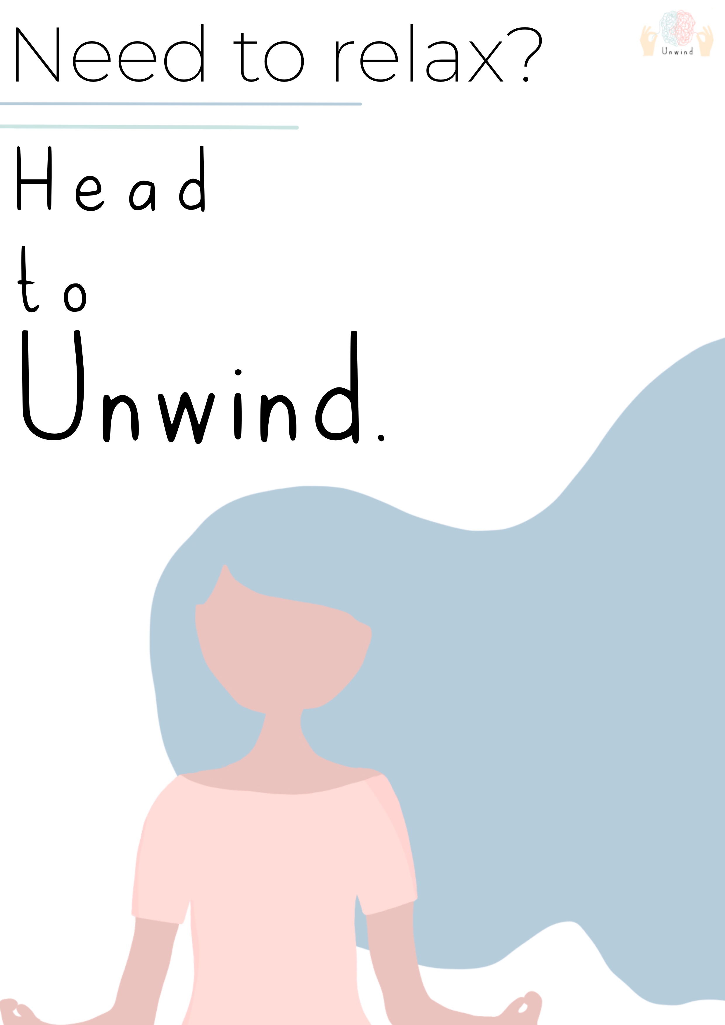
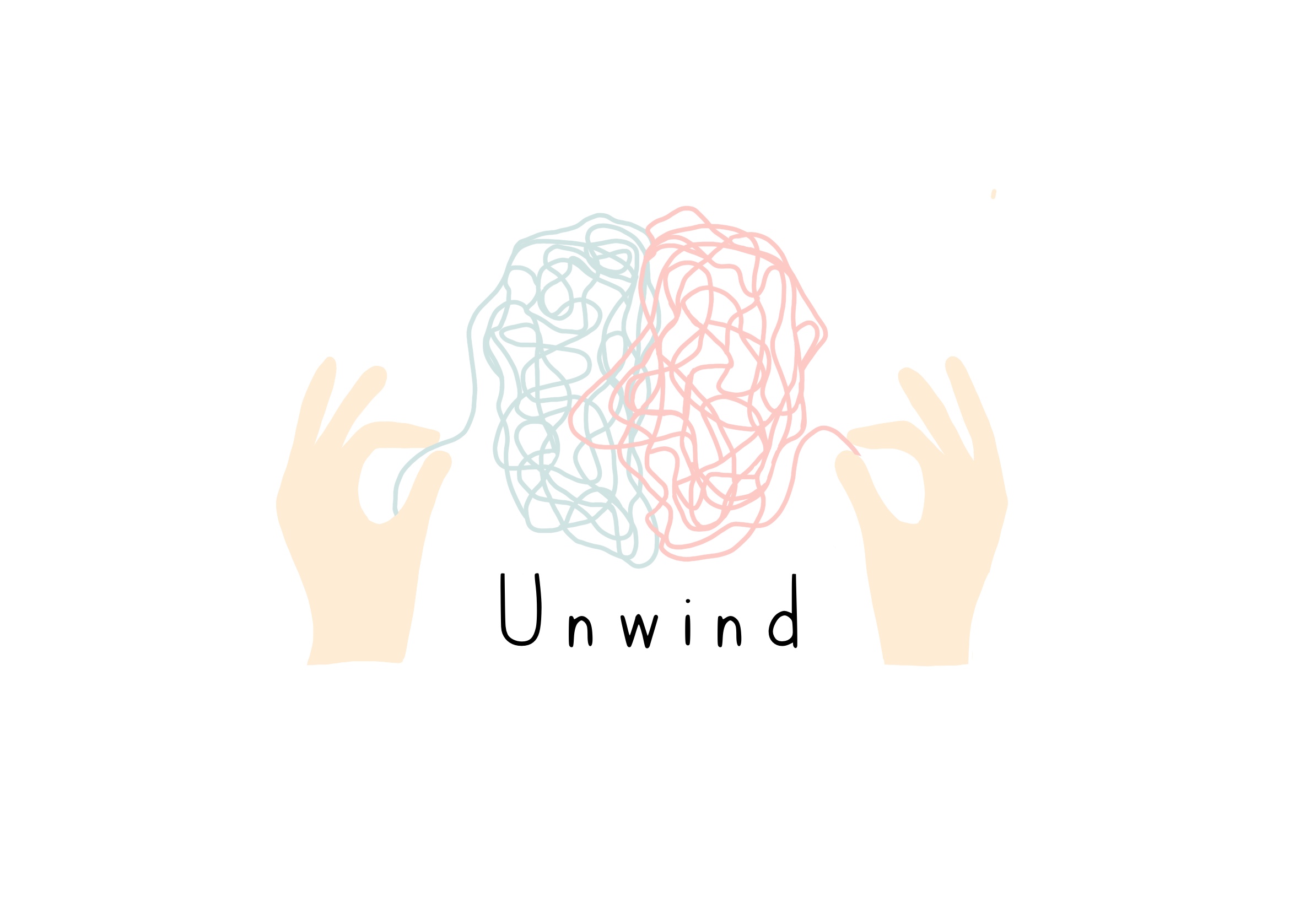
For the first logo, I drew a hand that is holding string in the shape of a brain/mind. The colours of the strings are the colours from our chosen colour palette, and I decided to design this graphic because it reflects the name of our brand and fits with our overall image. For the font, I downloaded a font from dafont called ‘cutesy’. When looking for fonts, I specifically looked for handwriting fonts as they seem more personal and not as corporate as other font styles such as san serif. I thought that my chosen font style suited our brand image more as the font looks more relaxing and easier to read.

unwind2

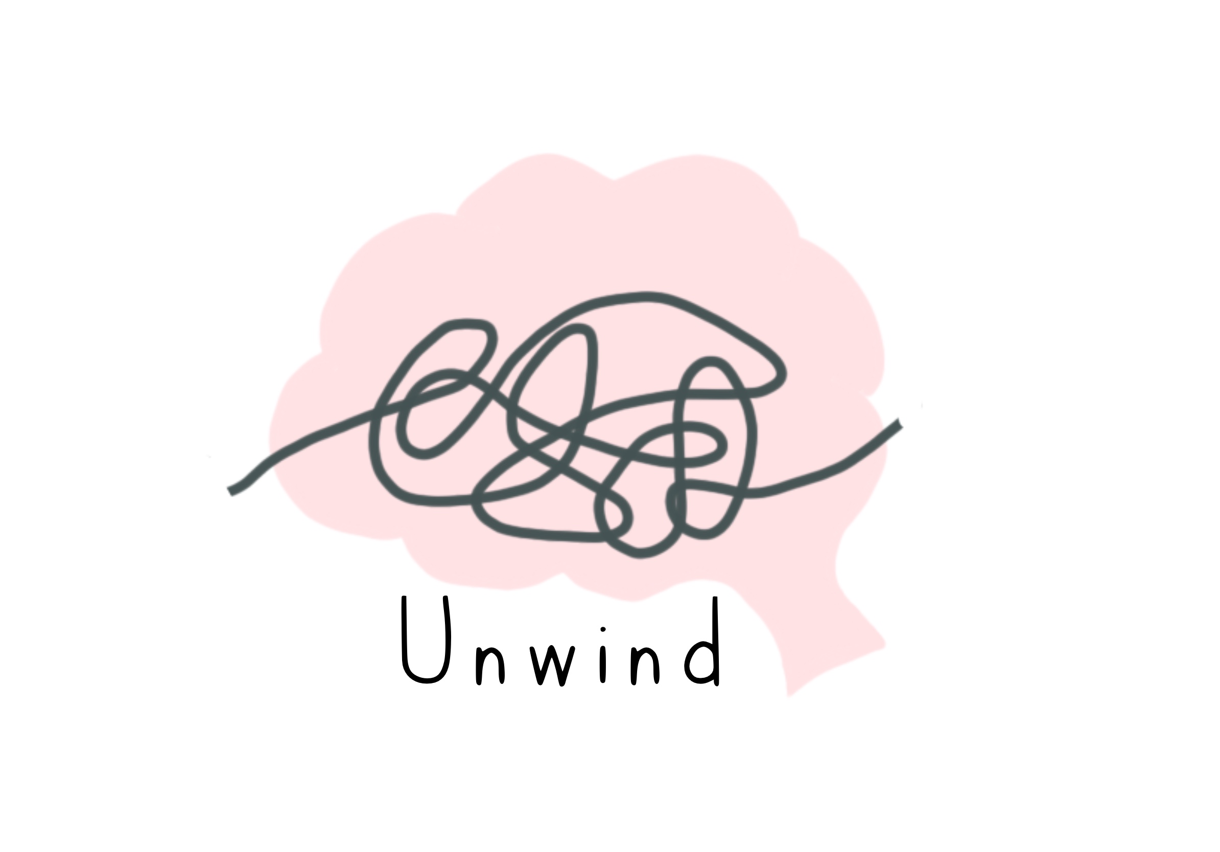
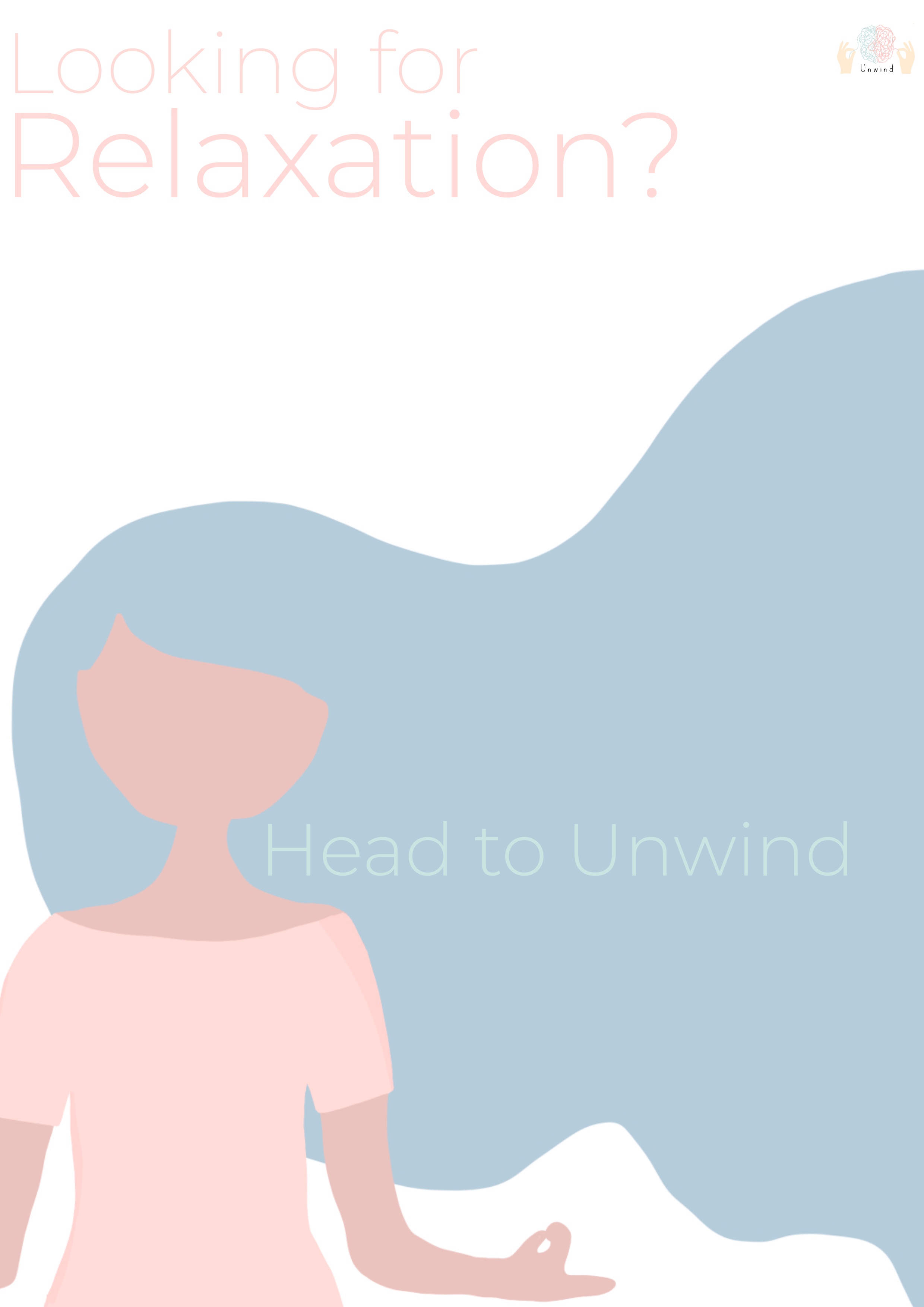
For my second design, I drew a brain in one of our brand colours, as well as lines inside the brain that make up the shape of a brain/mind. I designed this because it also reflects our brand name but in a different style to my first logo design. I decided to use the same font because it looks friendly and calming. I positioned it underneath the main graphic so that the graphic is the main focus.

unwind3

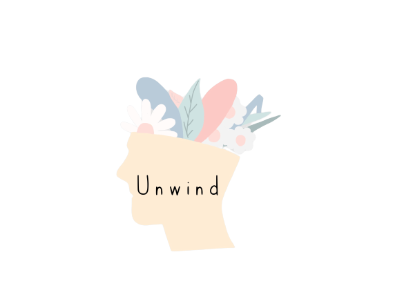
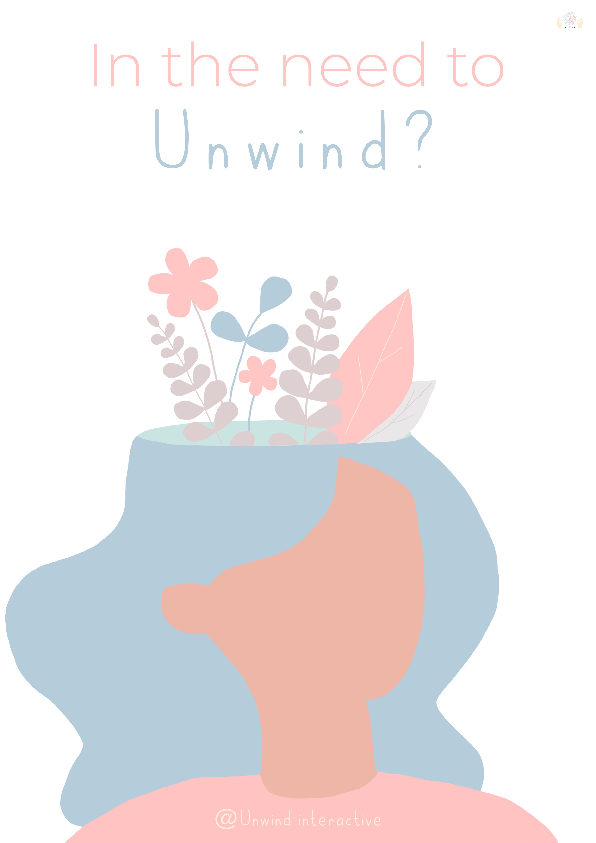
For the third design I went with a slightly different approach to the first two designs. When researching logo ideas, I saw that a lot of them included flowers and greenery to reflect peace and calmness. I decided to incorporate flowers/greenery in our brand colours to represent the state of peace our users will get when interacting with our website. The flower designs replace the look of the brain in a more approachable way as the flowers and greenery will attract the user.

Final Design:


unwind4

For the fourth design I went with a similar approach to the first two ideas. I decided to design two hands holding a brain made of lines/string that replicate the idea of the string unwinding. I chose to design this as it fits our overall brand image and represents our brand name. I used the branding colours so that it fits our theme. I used the same font again as I think the font I chose is suitable for our branding and fits well within the logo design.


Advertisement Posters:

Another task I did as a designer was to design advertisement posters. When finding ideas and inspiration for my poster designs, I decided to search for other wellness app/website poster designs to see what is commonly used in advertisement posters. I specifically looked at Headspace posters as I admired their aesthetic and wanted to try and incorporate their designs with my ideas. When looking at their posters, I noticed that they’re very minimal and colourful. They have an obvious colour scheme and brand design which is shown consistently throughout all of their posters. Their designs also consist of the same graphics which creates their branding image and use a limited amount of text. Their graphics usually take up the whole design with a few sentences. I also noticed that their posters include a statistic on how their app can help their users which would attract their audience.

placeholder

Poster Designs:

unwindposter

For my first design, I wanted a large graphic to be the main focal point of the poster so that our audience can clearly see what we’re trying to advertise. For this graphic, I drew a woman meditating in our brand colours. I positioned our logo in the top right corner so that the audience knows what company is advertising and for fonts, I chose to use the same font as our logo called ‘cutesy’ and another san serif font called ‘monsterrat’. I chose this second font as it contrasts with ‘cutesy’ and is easy to read and looks very modern and minimal.
I wanted my designs to be minimal as this is a common aesthetic when advertising wellness apps/websites and it makes the posters look simple and neat instead of overpowerful and busy which is important when advertising for mental health as it won’t overwhelm our audience. I put the phrase, ‘need to relax’? as it addresses our audience directly and gives them an insight into what our company is.

unwind2

For the second design, it is very similar to the first as I use the same graphic but at a larger size, so it takes up more of the poster. I used the same font choices too but changed the colours so that they were our branding colours instead of black. I decided to not use black text as the black was quite bold on the first poster and made it look not as put together, which is why I chose to use the branding colours on the font as it looks neater and blends well together with the graphic.

I used another phrase, ‘looking for relaxation’? so that our audience is addressed directly and knows what type of company we are advertising. I then put ‘head to unwind’ within my graphic so that more attention is drawn to it, but the audience will also be able to see what our brand is called and where they can find our services.

unwind3

For my third design, I wanted to follow the similar aesthetic as my other two designs. I kept with our branding colours so that our audience knows that it is our company and that our branding matches. I wanted my design to be minimal and have a graphic as the main focal point so that it attracts attention and so they aren’t too many words on the poster. I designed a new graphic which reflects a positive wellness which is what we want our customers to achieve when using our website.

For text, I wanted to address the audience again as it makes the advert more personal and friendly. I also wanted to include the name of our brand within the text phrase so that our name is somehow included on the poster. I positioned our logo in the top right corner so our users can see that it’s our brand, but I made it small so that it doesn’t overpower the graphic.

Social Media:

As a designer, I also had to create an Instagram page to promote our brand, and design posts to post on our account. I started off with looking at Headspace’s Instagram account to see how they designed their posts. Their page included a variety of vibrant colours in all of their posts, each post is usually a different bright colour. They include their signature graphics so that their audience knows who is posting, and a large, bold San serif font is used throughout all posts. I noticed that their posts are fairly simple and only include phrases, often quotes or advice on mental health or relaxation. Headspace’s posts also included other information such as positive affirmations, statistics, and information about their services.

Here is our Instagram page, https://www.instagram.com/unwindinteractive/. When designing my posts, I wanted to keep the designs quite basic so that the focus was on the text included. I used our branding colours as the background, a different colour in each post, so that our branding identity is clear throughout our Instagram. I drew simple shapes on the posts to make the background more appealing instead of just having the background colour and text. I used ‘monsterat’ for the main font because it fits our minimalistic theme and is easy to read. I kept the text in white because it contrasts well with the background colours and isn’t as harsh as black. I decided to post about a few different aspects such as mental health advice, statistics and what our brand will offer. I thought that posting advice and more will make our page more appealing and will attract more users as they can follow our Instagram for multiple reasons.

unwindinsta1
unwindinsta2
unwindinsta3
unwindinsta4
unwindinsta5
unwindinsta6