Researching Into Current Medical Apps
I first started with looking at the most popular and current medical/health applications available on the app store, so I could see what features they have to offer and if there is any competition,
such as PatientAccess, HeyPharmacist and the NHS app. For this, I decided to focus on the NHS app that is available in the United Kingdom.
The app offers users a large range of features such as, recieving health advice, register as an organ donor, order repeat prescriptions, set or change their nominated pharmacy and where they want
prescriptions to be sent to, view health records securely and manage their hopsital or clinic appointments with a specialist. To understand the pros and cons of this app and how I could make sure that
we do not implement any of the disadvantages into PatientPortal, I did some brief research into NHS user testing.
The majority of users said that they use the app to access their medical records, and ordering repeat prescriptions and booking appointments were the next most used feature. Users rated 'ordering prescriptions'
as the most useful feature of the app, and research showed that the design of the app is easy to navigate and user friendly. However, results showed that 'two factor authentication' was an annoyance, as users
were unsure why this was necessary each time they wanted to log in as it did not add much security. Appointment names could be hard to understand as less than half of the users were able to understand the names
of the appointments displayed in the app. This is because sometimes the full name of the appointment were long and not visible in the dropdown or across the screen.
In other cases, the clinician names and time periods were part of the appointment type which created confusion. More than 2/3rds of users found that complicated internal jargon and abbreviations
were used which did not make sense to them. Lastly, appointment availability did not always meet expectations, users were disappointed with the appointment slots that were available for booking and had expected more options.
Others were frustrated that their specific doctor was not available. Undertaking this initial research allowed me to understand how to make our prototype more user friendly and to be conscious about
the issues in current medical apps, and that we should not incorporate this user experience within our designs.
UX & UI Research
Before starting any low fidelity wireframing and mockups, I did some initial research into how I could prioritise the user experience and user interface design within my final prototype.
When researching, Shokurova (2020) states that simplicity is important when it comes to designing a medical app, as medicine is a complicated discipline and having a simple app to use will calm
its users and keep them focused. I discovered that functionality is vital for designing user interface as design and functionality should work together. Therefore, we should avoid clutter when it
comes to designing our interface as too much functionality can cause cluttered designs (Shokurova, 2020). I also discovered Pareto's Principle, which states that 80% of users tend to use no more than
20% of the options available. This showed me that I should prioritise and determine which features will be the most important to users. Clear navigation is also a must when it comes to the user
interface of a medical or healthcare application, and this usually involves the speed and ease of use.
(IndiaNIC Infotech, 2022)
Brand Design Research
I then undertook some brief research into branding and how to make these branding choices for our app. Ego-cms(2021) mentions that the medical industry is expressed with cold tones
that are calming and soothing, and do not pull too much attention. Therefore, the most common colour choices when it comes to medical apps are green, blue, white or even pink.
Blue symbolises loyalty, strength, wisdom and trust. Incorporating blue promises a tranquil environment which is needed while using a medical service. However, overdoing it can be dangerous as
not all cultures have the same interpretation, and you could also be at risk of being associated with someone else within the field. Green is the colour of nature and health, although, it is commonly
used in evironmental projects or herbal medicine. White is the most common colour for a clean and clear design, that has many different shades to be used. When using white, it is important to
add bright or contrasting elements to avoid the feeling of a surgery room, as it is not encouraged to make an app look too clinical. Lastly, pink is associated with women or children, which can make sense
to implement pink elements with design, if they are not too bright because it is common for individuals to have a distaste for bright pink.
Choosing the correct typograpghy is crucial when designing a medical app because the application should be as user friendly as possible. Therefore, choosing a san serif font is the best option because
it is the easiest to read and are easy to display across various devices and screen specifications without any issues(Steel Kiwi).
(Ego-cms, 2021)
Target Audience and User Personas
From our project brief created by our client, our target audience are individuals within the NHS and private hospitals such as doctors and nurses, and also patients with disabilities such as
deafness. Therefore, it was important for us to cater our designs specifically to our given target audience. I thought it was best to create user personas so that I had a better
understanding of the user's needs and requirements when it came to designing the interface. According to UX24/7(2018) user personas are valuable in UX design because it helps the designer to also understand negative
issues such as percieved obstacles or problems within the designs. Having an imaginary user in mind can help to focus the process of production immensely. Furthermore, if the designer has
defined and understood the personas accurately, it should give the designer a better handle on the sort of language, messages and imagery that the users will associate with and respond to.
I created these user personas with the help of ChatGPT. I asked the AI questions such as, 'can you create me a doctor user persona for a medical app?', as well as, 'can you create me a
deaf user persona for a medical app?' These questions were able to generate me a range of demographics, goals, motivations and pain points.
Creating the Brand
App Name Changes (User Testing)
To start off with the brand design, we wanted to suggest to our client a name change for the app. We recieved negative user testing when we spoke to our peers
and lecturers about the intial brand name, Krystal Clear. This is because the name did not indicate that it was a medical brand, and seemed to reflect crystals, or possibly
spiritual healing/health. When testing this name, our peers mentioned that the name reminds them of things such as window cleaning or jewellery, therefore, we thought it was
best to bring this to our client. Our client agreed with us and allowed us to brainstorm some new name ideas and we came up with names such as Lifeline, HealthHub, and PatientLine.
We then changed it to 'Lifeline', however, this did not stick as LifeLine is already a medical device on the market, so we changed the name to PatientLine. We thought that
PatientLine was a suitable choice as it indicates medicine with the words 'patient' and 'line' reflecting the line on a heart monitor. However, again, after a few weeks we were uncertain
whether this name reflected our overall unique selling point and aim of the app, so our final decision was PatientPortal. This name reflects our app as it shows that it will be the users 'portal'
to all of their health needs.
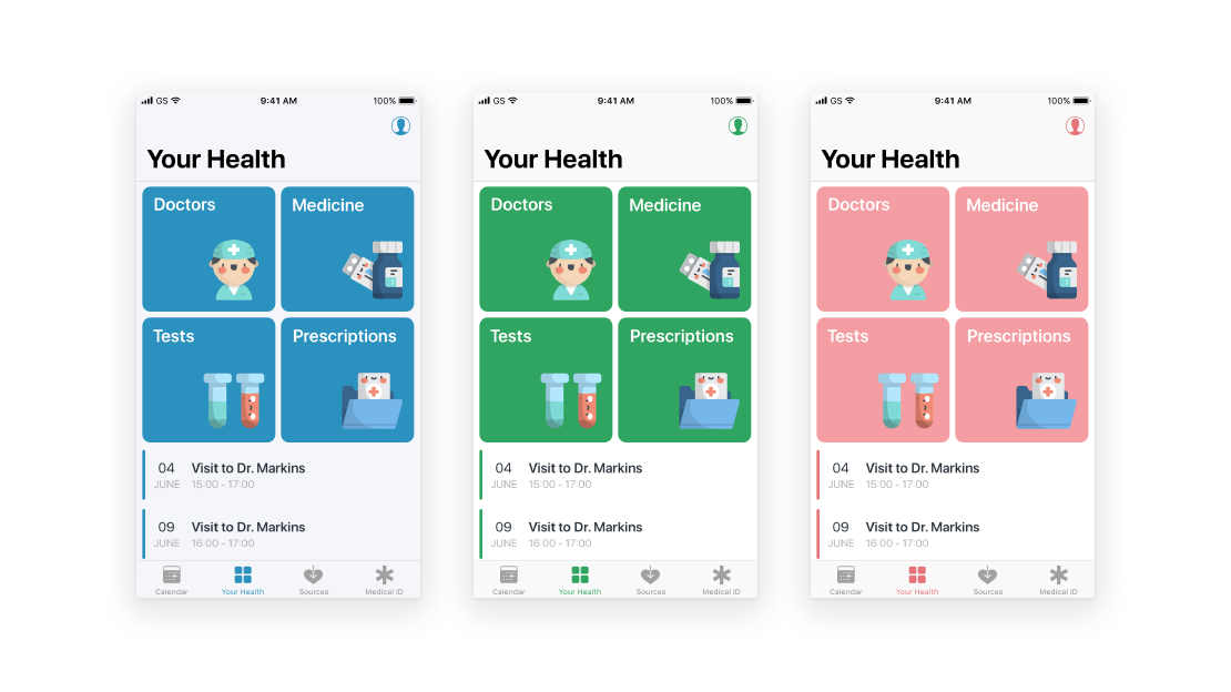
Brand Colours
After doing initial research, we thought that blue or green shades would be our best option, from the research I undertook earlier in the
project. My group member and I both came up with seperate colour palettes so that we could see what colours we were thinking of using, and then we placed these into our Milanote file for the
project. I first looked at current medical apps to see what colour choices they used, which seemed to mainly be corporate blues, greens or deep pinks such as the NHS and Patient Access.
My choices are seen on the bottom row in the image below. When finding colours, I went with fairly light and pastel colours to keep the app feeling fresh and postitive, so that it
does not feel too corporate or medical such as the NHS colours, as these can create negative feelings towards the users. However, I did not want to use too light of a colour palette so that our usability is as best
as it can be because we need to design for an audience of those with disabilities.
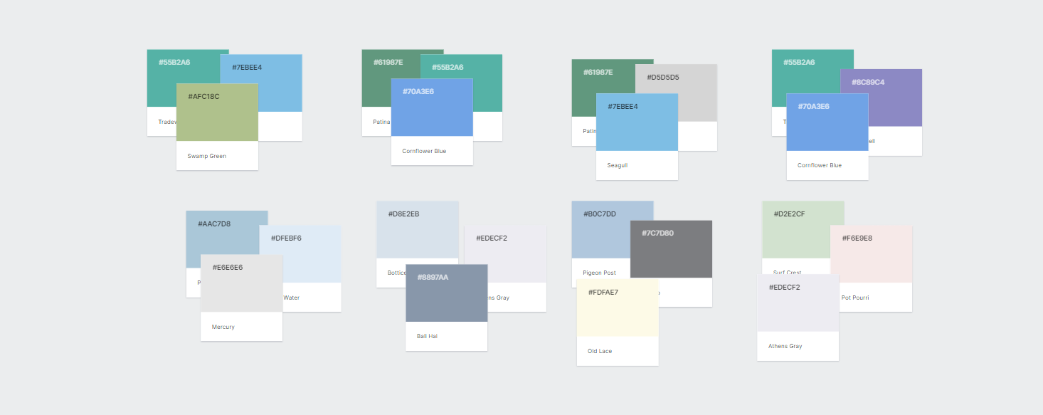
(Branding Colour Choices in Milanote)
After my group member and I negotiated what colours to use, we decided to combine a number of our colours together. Shown below, we chose a pastel blue and grey to
keep the app light and airy, and then a deeper purple and turquoise to use as accent colours and for call to action so that the design is not too white. These colours will work well together because it
does not make the app seem too corporate or sterile, as we want our users to feel calm and at peace when using the app, so that there is no added stress when it comes
to their health.

Official Brand Colours
Font Choices

Typography is a vital element of our design process that we need to decide on correctly, as this is a main focal point for making the app as user friendly as possible.
From carrying out my initial branding research, I knew that it was best to choose a san serif font because it is the easiest style of font to read and it can be easily displayed
on multiple screen sizes or specifications(Steel Kiwi). We then made a list of san serif fonts that are most commonly used within app design, which included fonts such as arial,
verdana, open sans, roboto, lato, nunito and montserrat. However, my group member then found a font called 'Barlow' which we thought was very modern and easy to read, but it was not
as popular as the other fonts we found so we decided to choose Barlow.
Final Brand Guidelines
As shown below, the two bold colours will be used as an accent colour and for call to action so that they make these elements of the interface stand out to the user.
The two muted and lighter colours will be used as the two main colours within the design as they will make the interface appear light and airy and the black
text will be easily readable against these colours, which will make the app accessible to more individuals.

Official Branding
Logo Design
Designing a logo for this project was fairly difficult as it was quite hard to come up with my own unique ideas, since most medical apps have the most obvious logo choices. For example,
PatientAccess has a logo of a heart, or it is common for health or medical companies to have just their company name in a san serif font for their logo. Such as, The NHS, Healthline and
Lloyds Pharmacy.
Inspiration
Before starting any logo designs, I went on to websites such as Pinterest and Dribbble to see other medical logo designs and to try and gain
inspiration before starting mine. I then added logos that I found into our MilaNote project board along with my group members ideas too.
Krystal Clear Sketches
At this stage of our project process, the app was still called Krystal Clear as we had not yet had our first client meeting to discuss name changes.
For this, I did a brief number of logo sketches, but did not make any high fidelity logos for Krystal Clear as by this time, we had changed the name to LifeLine.
Coming up with sketches for this name was difficult because it was hard to incorporate a crystal into a medical design, or to try and make it look
medical in any form.
LifeLine Sketches
After our first client meeting, we decided to change the name to Lifeline but this name did not last long because we were told that there is
a device used in hospitals and homes called Lifeline.
As this name included the word 'line' which reflected the line within a heart monitor, I wanted to try and incorporate a heart monitor design into these sketches. This
would have shown the audience that it is clearly a medical app.
PatientLine Sketches
Once we knew that Lifeline was unavailable, we changed the name to PatientLine as we liked the 'line' aspect of the name, and paired this with Patient to show
that the app is focused on patient care and information.
For these sketches, I tried to incorporate the heart monitor line so it was visable to the users that the app revolved around health. As
we had stuck with this name for a few weeks, I also made a number of high fidelity logos before making the final change to PatientPortal.
PatientLine Logos
Final Name Choice and Logo Design
After a few weeks with PatientLine, we thought that it was no longer suitable because it did not give the indication that users
could access the features available. So, my group member decided to play around with logo ideas for PatientPortal as this name indicates that
the users can access their health 'portal'.

(Logo design by Kate.)
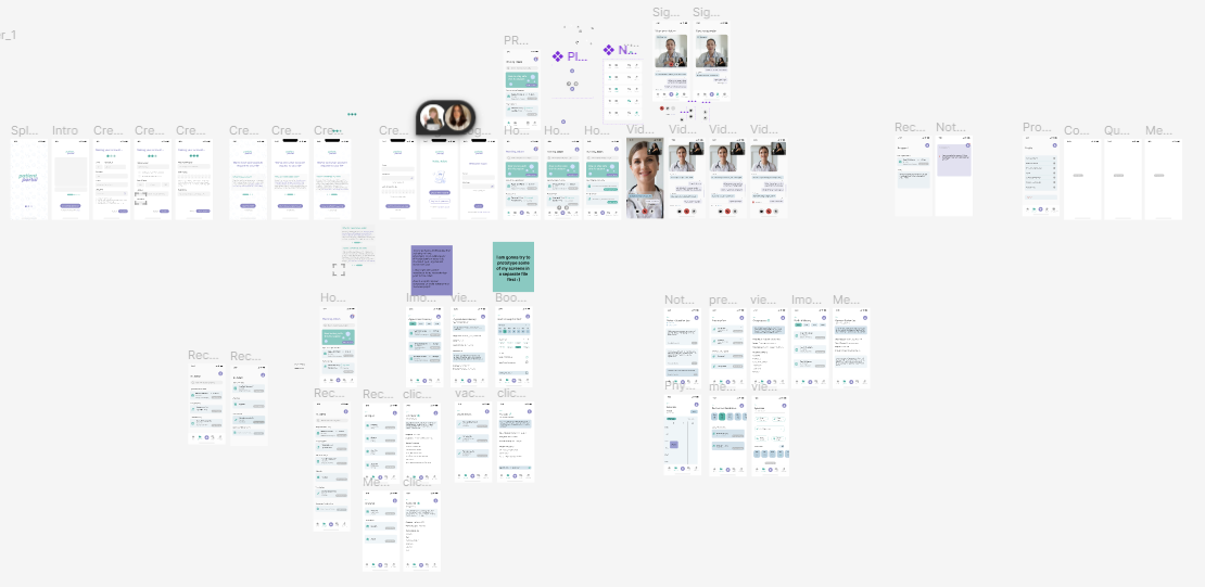
Wireframing and Sitemaps
Initial Site Map
This is the site map that I created at the beginning of the project back in February. Designing a site map helped me to easily view what screens will be designed and how
to link these screens together, and ensured me that no screens were forgotten.

Initial Sitemap
Lo-fi Wireframes
To start off the user interface design process, I drew basic low-fidelity wireframes to visualise the interface design and use this as a guide when it comes to
designing in Figma. I added brief annotations so that I could remember these elements when it came to the final design journey. These wireframes also made it easy for us
to make quick and easy changes to our designs as well.
Prototype
For the user interface design, I tried to stay with the same layout and theme throughout my designs to keep the navigation and user experience as simple as possible
for the user. Therefore, a number of my interface designs look very similar, to ensure design consistency throughout the app. Once we started the interface design process,
as a group we thought it would be best to work on seperate screens so that we complete a higher number of high fidelity screens. My group member focussed more on the screens
revolved around the inclusivity of users with disabilities.
Working in Figma
For this project my group member and I thought it would best to work on this app in Figma. This is because Figma offers a collaborative feature in which
we can both work in the same file in real time, allowing us to see what each other is working on, give and recieve feedback and comments. Using this feature
also reflects what working in industry is like as the Figma collaborative tool is very commonly used with the design workplace. According to Figma
themselves(2023), companies such as Netflix, Zoom and Twitter also use the platform, which demonstrates how beneficial the app and collaboration
feature really is.
Using Figma really helped us to work together as we were able to explain to eachother what we were doing and understand the screen designs we were both completing. This also saved us a lot of time
as it meant we could talk to each other within the file instead of needing to hold regular meetings on Microsoft Teams. Lastly, Figma allows you to create multiple 'pages' with
one for the app design and then we created a second and third page for the stylesheet and colourways. This helped us stay on track with the branding and colour palette
so that we stayed consistent within our screens.
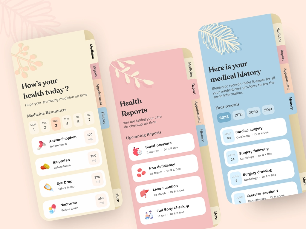
Final Prototype Design

'My Record' Screens: For the overall interface, we wanted to keep the design very clean and minimal to garuntee the best user experience possible, as for this type of app,
the features are more important than the overall aesthetic. The 'my record' page is where the user will find the majority of their information such as appointment history,
medical history, notes, prescriptions and more. I also included a search bar so that users can find any certain information a lot faster than looking for it manually. For each
section, I placed an icon that reflects that section. Such as a 'tablet/pill' icon for Prescriptions. This will help the user identify each section more easily as the icons
are in the chosen accent colour so that they will stand out and will be identifiable.

Appointment Screens: For the 'appointment' element of the app, I wanted users to be able to access their appointment history and the details of these appointments, as well
as being able to book an appointment. When booking an appointment, the selected day, time and location will be highlighted in our accent colour. The times that are slightly grey in
text, show that these times are not available.
Users having access to their history is important as they will be able to look at the notes and information accquired from that appointment,
instead of having to call the doctor to find out this information.

Prescriptions Screens: Having access to the user's prescriptions allows the user to be able to find all of their
prescription information in one place. They will be able to read each current/previous prescription's vital information such as what it is prescribed for,
the dosage and possible side effects. For this screen, I placed the prescription explanation in a seperate box element to make this piece of information
the most visible for the user. This is because it is crucial for the user to know how their medicine works and what it does. I then equally spaced the
extra information about the prescription so that the user can easily view this information and does not get confused.
Medical History Screens: This feature allows the user to access their medical record with information such as surgeries and procedures. They will be able
to find out the details of each element of medical history such as 'surgery follow up'. For the history details, I added another box element at the top of
the screen to outline what this page of history is about. At the bottom of the screen, I added a second box in the primary colour swatch to outline the notes
given by the doctor about that certain piece of medical history. It was important to highlight this information in another box element as it makes this piece
of information more visible to the user so that they will be able to navigate to this quickly and easily.

Allergies Screens: These screens include allergy information of the user. They will be able to access each allergy and view its details such as
what the allergy is, medication and symptoms. The user will also have access to any medication allergies such as penicillin. I thought that it was important to include
this type of allergy as well as they can be just as fatal as normal allergies.

Vaccines Screens: Users will be able to access all of their vaccination history and upcoming jabs. When pressing 'view vaccine', the user will
have access to the specific vaccination information such as why the vaccine is important, date of vaccine and dosage. Being able to view vaccine information
is important because it shows the user when they last had a vaccination and when their next ones are. Therefore, the user will be able to stay on top of their
needed vaccinations.
Notes and Questions Log Screen: Having a 'notes' feature was an important element to our client, as she wanted a feature where patients will be able to make notes
before seeing their doctor, as well as a place for doctors to make notes for the patient. For this design, I used two colours to show which notes are made by the patient
and doctor. The light blue is notes made by the patient/user, and the darker blue is by the doctor. Having this colour difference will help the user to be able to identify
which notes are theirs, and which is their doctors.

Calendar Screen: This was another feature our client suggested having within the app. Our client wanted a place were patients were able to access any physio charts. However,
I thought that this was quite hard to incorporate so I decided to design a 'calendar' feature instead as this will allow the user to add in any extra information to the calendar as well.
Medication Reminders Screens: We thought it would be a good idea to add a 'medication reminder' feature into the app so that users were able to access this and all of the other features available
in one app, as medication reminder apps are fairly common in the app store. Therefore, this will make it easier for the user as they will be able to view medication information and reminders in the
same place instead of needing to download multiple apps. For the reminders feature, I added seperate box elements at the top of the screen that would be swiped through by the user to find a
specific day. This was the most common way of designing this feature when it came to looking for inspiration. Once the user presses 'view reminder' they would be able to access the settings of
this reminder and be able to change information such as the dosage and the time of medication.
Usability Testing
Once I had completed my interface designs, the next step was to recieve usability testing to ensure that the user experience of my designs are to its best quality.
For this, I asked a fellow peer to review my screens and give any feedback or criticisms. Even though this peer was not the intended target audience, I thought that it
was still crucial to try and recieve usability testing. In this case, my user tester only had positive feedback to give which was a big compliment to me. For this user,
I asked questions such as, "is the text too small"?, and "do you understand how the screens work"? Asking these questions allowed me to get sufficient feedback.
As this user was not familiar with UX design, they were not sure on what criticisms to give, so they gave me this feedback:
- The app's interface is clean and easy to navigate. The layout was well organised, making it easy to find the information needed.
- The colour scheme was pleasing and the typography was clear and easy to read.
- One of the features I particularly liked was the use of icons. They were used effectively to convey important information and guide me through the app's various features.
Reading this feedback allowed me to see that I had managed to achieve the overall interface design that we were intending for which made me proud
of the designs that I had completed in our given time frame.
Working Prototype
After completing a level of usability testing, it was time to try and prototype my screens properly so that we could see how the app would really work. This
was my first time using the 'prototype' feature on Figma so it was fairly difficult to figure out at first and required me to watch a number of YouTube tutorials.
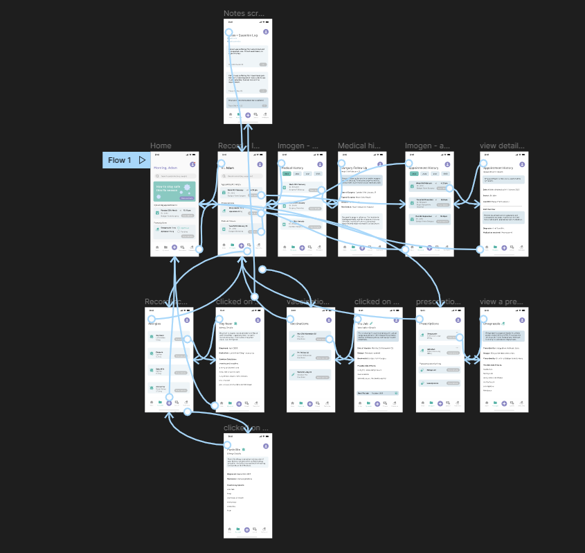
Here you can see all of the interactions that I included within my working prototype in Figma. To allow my screens to 'join together' I needed to add interactions between my screens.
I used animations called 'push' and 'gentle' which is what creates the gentle pushing motion between all of the screens.
Project Reflection and Analysis
Sustainable Goal 17:
(United Nations, 2021) For this project, I needed to try and include relevance to Sustainable Goal 17 which is 'to strengthen the means of implementation
and revitalise the global partnership of sustainable development.' PatientPortal achieves this goal because it would partner with
the NHS and private hospitals to provide patient care to those with disabilities, which demonstrates the
partnership aspect of the goal. This shows that this project also connects to goal 17 because it requires technology
in order for the partnership aspect to work.
PatientPortal also achieves sustainable development
goal 3 which is to ensure healthy lives and promote well-being for all at all ages. This is because the app will ensure
healthy living by having a place for patients to have access to their medical records and be able to have consultations
with their doctors regarding any health issues.
Time Management
Regarding time management, I was able to stay on task and complete a high number of interface designs even though we started the interface process later into the semester than expected.
I would often try to treat my university projects as a full time job and work on them between 9 and 5pm every day, and sometimes in the evening as well if I wanted to carry on working.
Using this process allowed me to get into a routine of completing my projects every day and I saw a big improvement in work quality and how much more work I was able to finish.
Each day, I would write a physical list of the tasks I aimed to achieve that day which helped me visualise what needed to be completed and how much time I had. I also
created a timeline at the start of the semester so that I could keep track of what we were doing and when we were completing these tasks by.
PatientPortal was an enjoyable project for me because it revolved around user interface design, a favourite area of design for me, and I was able to work on a project with
a fellow talented designer. This project was a small step outside of my comfort zone because I had never designed the user interface for a medical application before, so it required a
lot more research and design thinking. Although this was a client project, our group decided to not work alongside our client due to unforseen circumstances. Therefore, we would often
recieve feedback from our lecturer instead. This aspect also made the project less stressful because we had more freedom with our designs and what features to include, but we did try to
stay on track with the brief given to us so it still felt as if we were completing this project for a client. Luckily, deciding to not work alongside our client did not cause any set backs and
we were able to stay on track with our progress. However, as this app design was a huge task to complete, not all features within the app were able to be completed within our given timeframe
as it was only me and one other designer.
What went well:
I stepped outside of my designing comfort zone by designing the user interface for a style of app that I have never done before. Completing a user interface project allowed
me to improve my UX and UI skills in Figma and learning how to use the prototype tool which improves the overall quality of my work. My team member and I worked well as a pair because we are both
keen user experience learners so we complimented each other fairly well. We communicated effectively by holding a number of Teams meetings at the start of the project to strengthen our knowledge
of what we will be completing over the next 12 weeks. We would often be working in the Figma file at the same time too, allowing us to talk in real time and see what each other is doing. This made
the design process a lot faster and more effective. I also think that I managed to design a high number of interface designs within the timeframe and alongside my other projects too. Lastly, I
believe that as a group, our prototype was able to solve our identified problem that we needed to try and answer as we were successful at including the essential features such as access to medical records,
video consultation(completed by my group member) and more.
Areas to improve:
I think that I could have spent more time learning how to use the Figma prototype feature so that I had a higher quality prototype to show, as I believe that mine is fairly basic. I also
left usability testing fairly late within our project timeframe and could only ask one peer for testing. I only asked one peer for testing so that I could apply any testing results quickly
before submission. If I were to do this project again, I would complete the usability testing earlier on in the semester so that I had time to ask a number of individuals for testing and I would have
recieved a larger range of results to apply to my designs.
Handover Document:
We were also required to create a handover document to give to our client, so that they are able to carry on with the
project themselves.